Today's Project
Click here to see the whole project
Course Outline
Morning
- Intro to HTML
- Write the HTML for your project
- Intro to CSS
Afternoon
- More CSS
- Final touches
- Fin! And next steps
Let's get set up
You should have already downloaded the following:
- Sublime Text (link) - a popular text editor that highlights your code and has other helpful features.
- Google Chrome (link) - Choose a modern web browser that has good development tools to help make building web pages easier. Firefox is a good option, too! You'll also want to make one of these modern browsers your default browser. Here are the instructions.
- Today's slides and files (link). You'll see a "Download Zip" button on the bottom right of the page. Click it! To open the slides, unzip the folder (on Windows, right click and select "Extract All"). Right click on "index.html" or "index" and "Open in Chrome".
Opening HTML files in your browser
First, what is a browser?
The browser's main functionality is to present the "web resource" you choose, by requesting it from the server and displaying it in the browser window. The "web resource" is usually an HTML document, but may also be a PDF, image, or other type.
What is an HTML document?
We'll get into this in more detail shortly. For now, let's check out an example. Go to http://ladieslearningcode.com. Right-click and select "View Page Source". That's HTML.
We'll learn to write our own HTML today. For now, let's learn to open an HTML document (like the ones we'll create later) in our browser.
- Open Sublime Text and go to "File -> Open".
- Navigate to the folder called "Project" in the folder you downloaded with today's slides.
- With the entire folder selected (not just one file within it), click "Open".
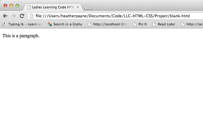
- Now that the folder is open in Sublime, click on "blank.html" so that it fills the screen. Now, right click and select "Open in Browser". (If your default browser isn't set to Chrome, here are the instructions.)
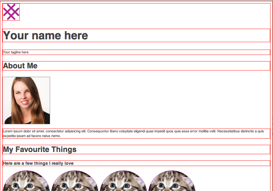
You should see something like this:
Now, let's make a change to our file and re-open it in our browser.
Dive back in to Sublime Text...
- Change something. For example, change the text within the <p> and </p> tags.
- Save your file (CMD + S or CONTROL + S)
- Right click and select "Open in Browser".
- Change something else and open it in your browser again, just to make sure you've got it!
- After saving, you can also just refresh your browser to see the changes (rather than opening your file in a new tab every time!)
A note: don't be scared about breaking anything or doing something wrong. The stuff we're doing today is what computers were designed to do! Feel free to play around, take risks and make mistakes. That's the best way to learn.
What are HTML & CSS?
Let's start with HTML...
It's the content layer
HTML (HyperText Markup Language) is what webpages are made out of.
We use HTML to describe each part of a webpage is to the browser, so that our content is displayed properly. We help our browsers to understand how we want things displayed by using tags. Here are a few examples of tags that you've probably seen before:
- <h1> and </h1>
- <p> and </p>
- <strong> and </strong>
To create an HTML file, you need to have .html at the end (sort of like how you need .pdf at the end of PDF documents).
Quick exercise: Let's save a new file as an HTML file
- In Sublime Text, click "File -> New File"
- By default, the file type is "Plain Text" not HTML
- You have two choices for saving this file as an HTML file:
- On the bottom right corner, you should see the words "Plain Text". Click the words, and select HTML from the list. Save the file by clicking CMD + S or CONTROL + S. Call it anything, save it anywhere. We won't be using it for anything else.
- Click on "File -> Save As". Give your file a name and add .html at the end (for example, "puppydog.html"). Click save. You can save it anywhere - we won't be using this file for anything else.
The Nuts and Bolts of HTML
When we write HTML, we create HTML Elements by wrapping our content in tags. These tags describe the content that is inside of them, NOT what they look like. We use different kinds of tags to create multiple elements and all together they make up something called our HTML Document.
It is important to understand that HTML has very little to do with the style of your website or the look of the content - that is what CSS is for.
Speaking of CSS...
It's what makes the web look nice.
What is CSS?
CSS (Cascading Style Sheets) is what makes websites look nice.
While HTML tells the browser what different parts of the page are, CSS says what those pieces should look like.
For example, p means paragraph in HTML. If we wanted to make all of our paragraphs red and underlined, we'd do something like:
p {
  color: red;
  text-decoration: underline;
}
Let's add this to our HTML document
To indicate that we're adding CSS to blank.html, we need to find the opening and closing <style> tags between our opening and closing <head> tags.
  <!doctype html>
    <head>
      <title>Ladies Learning Code HTML and CSS</title>
      <style>
        p {
        color: red;
        text-decoration: underline;
        }
      </style>
    </head>
    <body>
      <p>This is a paragraph</p>
    </body>
  </html>
Ta-da!
You just created your first website.
HTML + CSS = website
A note about HTML and CSS...
HTML and CSS are sort of like languages, but they're DIFFERENT languages. Just like French or Italian, they each have their own set of rules. It takes time to learn these languages. Don't worry if you don't get it all right away.
Websites without CSS...
This:

Websites without CSS...
Becomes this:
Why is that again?
Because HTML defines content, and CSS defines the look and layout (it makes the web look nice).
Let's focus on HTML for now
Time to start writing some HTML (which is also called "markup")
You can remove what we added between <style> and </style> for now. Keep <style> and </style> there!
HTML tags
The structure of a webpage is defined by HTML tags. Angled brackets denote tags, like this:
<tag>
Think about HTML tags like the beams of a house.
It's what holds up a webpage.
HTML tags
Tags typically come in pairs -- an opening tag and a closing tag with a forward slash:
<tag></tag>
Some examples that you've already seen:
<!DOCTYPE html>
<html>
  <head>
    <title> </title>
  </head>
  <body>
  </body>
</html>
HTML tags
Tags can be "nested" within other tags, like this:
<tag><tag></tag></tag>
(This relationship is often referred to using the terms "parent" node and "child" nodes.)
In the example below:
<title>is nested between opening and closing<head>tags so<head>is the parent node and<title>is the child node.- Going further,
<head>is also (at the same time) a child node of<html>. - While
<html>is the always the "root" node and has no parent nodes. - Notice too that
<head>and<body>are on the same level. They are both child nodes of<html>. They're like sublings!
<!DOCTYPE html>
<html>
  <head>
    <title> </title>
  </head>
  <body>
  </body>
</html>
<!DOCTYPE html>
<html>
  <head>
    <title> </title>
  </head>
  <body>
  </body>
</html>
What goes in the <head> and what goes in the <body>?
Things that you put in the <body> of your HTML document will show up on your webpage. Things that you put in the <head> of your HTML document won't show up. You can think of the <head> as a place to write secret notes to your browser. For example, our styles go in the head. We don't want our styles to show up on our page, but we do want our browser to apply the styles.
Exercise: Open the file "blank.html" in Sublime Text
- Change the content within the opening and closing
<title>tags, and observe the change in your browser. - Add an additional paragraph.
- Add a few headers to the page, above each paragraph. Hint: you'll need to use some or all of the following tags:
<h1>and</h1>,<h2>and</h2>, and you can even try using h3, h4, h5 and h6, if you like. - Try adding three links. The code for a link looks like this:
<a href="http://link.com">Click here</a>
Don't worry too much about WHERE you're putting things for now. Just write some code!
Don't forget to save and refresh your browser to see your code in action!
A note about attributes
Attributes are another important part of HTML markup.
An HTML attribute is a modifier of an HTML element. HTML attributes generally appear as name-value pairs, separated by "=", and are written within the start tag of an element, after the element's name:
<tag attribute="value">(content to be modified by the tag)</tag>Where "tag" names the HTML element and "attribute" is the name of the attribute.
Here's an example of an attribute that we've already seen today:
<a href="link.com">Click here</a>In this case, "a" is the tag, "href" is the attribute and "http://link.com" is the value.
Exercise: Let's write the markup for our final project
The output (what you'll see in your browser) of this exercise is on the next slide. Write the HTML.
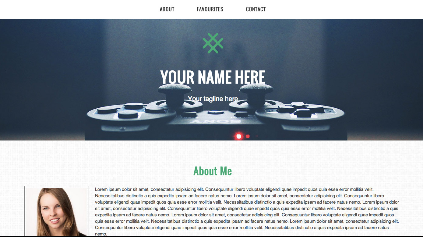
Write the HTML that will output this:
Hint: You'll want to use <h1> and </h1> once, <h2> and </h2> three times and <h3> and </h3> once.
You can generate your own placeholder text at http://www.lipsum.com. Or, you can try Cupcake Ipsum or Bacon Ipsum, for something new.
Adding images
Let's learn to add images to our webpages. Note that image tags are unique in that they are "self-closing" - there is no closing tag.
Let's start by adding an image that is hosted online. Here's the code:
<img src="http://placekitten.com/g/200/200">
Try copying and pasting that line of code into your project, right under the opening <body> tag.
Next, try finding a different image online and replacing the kitten photo.
Adding images, Part 2
You can add images another way - rather than linking to images hosted online, you can link to images in a folder on your computer.
In the Project folder, at the same level as "blank.html", there's an image called "logo.png". To include this image on our website, we'll need the following code:
<img src="logo.png">
Try copying and pasting that line of code into your project, right under the opening <body> tag.
Next, try replacing that image with one of the images in the Project "images" folder. Hint: it will look similar, but with "images/" in front of the image name. (This is because "images" is the name of the folder - we have to tell our browser where to look.)
Exercise: Add a logo and profile image to your project
The output (what you'll see in your browser) of this exercise is on the next slide. Write the HTML.
Hint: the logo image is called "logo.png", and the placeholder profile image is called "profile.jpg". Both can be found inside the "images" folder.
Write the HTML that will output this:
A quick note about image types:
There are three main image types: jpg, png and gif. Here's a general rule of thumb:
- Using a large image or photograph: choose jpg
- For icons, logos, text or anything that requires transparency: choose png
- For animations, especially of cats: choose gif (this is a joke)

Exercise: Add a few more images
Your output should look like what's on the following slide.
- Add images of your favourite things (check out this link and scroll down to see the section we're talking about). Try not to choose huge images right now - we'll show you how to resize images using CSS later.
- Add Twitter, Facebook and LinkedIn icons to the links - you'll have to use nested tags for this one, so that the image itself is actually a link! You'll find logos you can use in the Project/images folder.
Write the HTML that will output this:
And that's it!
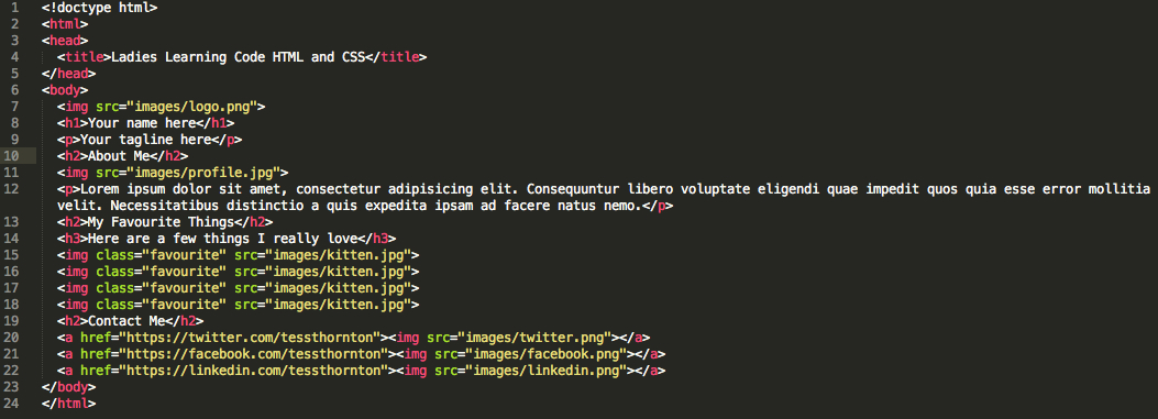
We've written all of the HTML that we'll need for today's project! Your markup should look like this:
A note about organization
Did you see how the markup in the previous slide was really clean and easy to read? It's because everything is indented properly.
Take a few moments now to clean up your code and make it look like the previous slide. Once we get into CSS, you'll be grateful!
And now, on to CSS!
CSS basics
CSS is closely paired with HTML
CSS doesn't do anything on its own, it's the presentation layer on top of a content base
If HTML is the beams of the house, CSS is the layout, paint, and decorations
CSS Syntax
CSS is made up of rules that refer to HTML elements (like <p> and <ul>), and define what those elements should look like.
A CSS rule is made up of a selector and one or more declarations
A selector tells the browser what element(s) we are styling.
It looks like this:
h2 {}The above selector will select all <h2> elements and apply our styles to them. Our styles will go between the curly brackets.
CSS Syntax
A declaration tells the browser what style we want to apply to our element
A declaration is always made up of two parts: a property and a value
A property tells the browser what we are modifying (ex. font, colour, size)
A value tells the browser how to modify the property (ex. Arial, green, small)
A declaration looks like this:
background-color: green;CSS Syntax
background-color: green;The value (the part after the colon) is specific to the property type
Ex. size-related properties like height, width, or font-size are usually specified in px (pixels), while colour-related properties are specified with a colour name or code
It's very important that you write the syntax correctly, with a colon after the property name and a semi-colon after the value.
Adding CSS to HTML
You write CSS rules in a set of <style></style> tags
You add the style tags to the <head> of your HTML document like this:
<html>
  <head>
    <style>
      h2 {
        background-color: green;
      }
    </style>
  </head>
  <body>

  </body>
</html>
CSS Syntax
When we put selectors and declarations together, they make a CSS rule, which looks like this:
h2 {
  background-color: green;
}
This rule will select all <h2> elements and change their background colour to green.
Try copying and pasting the above code in between the <style> tags and refreshing the page in your browser.
CSS Syntax
We can add multiple declarations (property: value; sets) to one selector to modify multiple properties:
  h2 {
    background-color: green;
    font-size: 28px;
  }
Make sure you always end each declaration with a semi-colon
Try replacing the previous rule for <h2> with this one and refreshing your browser
Next, clear out all the code you added between the <style> tags. We're adding more soon!
Exercise: First CSS Rule
- Find the set of
<style>tags in the<head>of blank.html - In between the two tags, write a selector for the
<body>tag of the document - Next, add a
color:property with a value ofblue;
body {
  color: blue;
}
All the text on the page is now blue: this is because the <body> tag is the highest-level tag we can see on the page, so the color property applies to the body AND all its children, including every heading, paragraph, and list item.
Using Hex Codes
Let's change the text to a colour that's easier to read.
We're going to use a hex code, which is a 6-character code that specifies a colour.
You don't have to understand how they work, just remember that they start with a # sign. It might help you to know the Hex codes for some of the basic colours:
- White:
#FFFFFF - Black:
#000000 - Red:
#FF0000 - Green:
#00FF00 - Blue:
#0000FF
The code for a nice dark grey is #444444. Let's add it.
body {
  color: #444444;
}
Check outhttp://colorpicker.com for more awesome colours!
Styling Type with CSS
There are lots of CSS properties which let us style the text in our HTML:
font-sizefont-weightfont-stylefont-familycolorline-height
Styling Type with CSS, Part 2
Let's change the font to a sans-serif like Helvetica:
  body {
    color: #444444;
    font-family: Helvetica, Arial, sans-serif;
  }
The font-family property accepts a list of font names: the first font is your first-choice font, the next ones are fallbacks in case that font is not available. Not all fonts are commonly available, so try to stick to 'web-safe' fonts like:
- Arial
- Verdana
- Times New Roman
- Georgia
- Courier
Changing Font Sizes
If we want to make our <h1> and <h2> tags a bit bigger:
h1 {
  font-size: 48px;
}
h2 {
  font-size: 32px;
}
Changing Line Height
We can change the line height (or leading) with the line-height property to make it easier to read
line-height is specified as a multiple of the size of the font: so a value of 1.4 means the lines will be 1.4x as tall as the text.
p {
  line-height: 1.4;
}
Styling Images
Let's add a dark border around the profile image. Start by writing a selector to pick out the <img> tag.
img {}
The border property has 3 parts: the width, the style, and the colour. So, if we want a 1px wide, solid, grey border, we use:
img {
  border: 1px solid grey;
}
Being More Specific
Our border is now applying to all images on the page, including our logo. We don't want that, so we need a way to target only the profile image.
HTML gives us a way to attach extra identifying information to HTML elements so that we can target them. We call these "classes".
Classes are attributes that you add on to tags.
<p class="classname"></p>
Targeting an Element with a Class
We can write a selector in our css to target the element we added a class to using a .
p.classname {}
And then apply the styles we want to only the item with the class:
p.classname {
  color: red;
}
Exercise: Style Profile Image
- Add some style to your profile image!
- Add a class of
profileto the tag for your profile image - Target that class in your CSS with the selector
img.profile - Then add a border of any color you like
- If your picture is too big, you can resize it using the
widthandheightproperties, which are specified inpx(pixels). Try 200 x 200 px. An example of how to usewidthandheightis below:
img {
  width: 200px;
  height: 200px;
}
Solution: Style Profile Image
Your HTML should look something like this:
<img class="profile" src="images/profile.jpg">
And your CSS should look something like this:
img.profile {
  border: 1px solid grey;
  width: 200px;
  height:200px;
}
Adding More Classes
We can do the same thing to style our "favourite things" images.
Since we probably want all four images to have the same styles, we can add the same class to each.
Add a class of "favourite" to each of the four images.
<img class="favourite" src="images/kitten.jpg" >
Add some styles to your images, using things like width, height, and border.
More Stuff You Can Do
- Try something fun like
border-radius: 50%; - Or
border: 3px dotted pink; - Or even
box-shadow: 0 0 4px grey; - Your CSS might look something like this:
img.favourite {
  border: 1px solid grey;
  width: 200px;
  height: 200px;
  border-radius: 50%;
}
Don't worry if it seems like there are a lot of CSS properties to remember. Keep looking them up on the internet and they'll sink in eventually. Even the pros have to look things up every once in a while :)
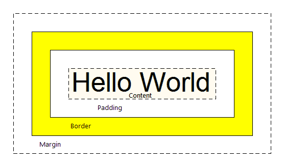
The Box Model
This is the trickiest part of CSS, don't worry if it seems confusing at first!
The CSS "Box Model" describes the way CSS styles the size and spacing of HTML elements.
To understand the box model, we need to understand how the browser "sees" HTML elements.
To the browser, every HTML element is a rectangular box.
If we show the outlines of all the elements in an HTML document, it looks a bit like the next slide:
The Box Model
CSS uses 5 properties to determine the size and spacing of these boxes:
Margin,padding,border,width, andheight- These 5 properties make up the Box Model
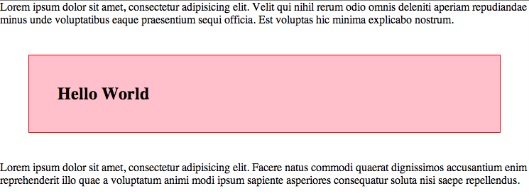
Margin and Padding
- Let's say we have 3 elements in our HTML document: a
<p>, an<h2>, and another<p> - Let's put a red border around the
<h2>and add a pink background:
h2 {
  border: 1px solid red;
  background: pink;
}
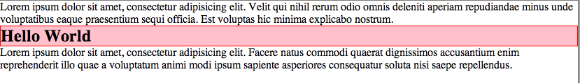
Margins
There are two CSS properties for adding space around our elements: margin, and padding
The margin property adds space around the element, outside of the border:
h2 {
  margin: 40px;
}
This code adds 40px of space on every side of the element.
Padding
If we want to add some space inside the border, we use the padding property:
h2 {
  margin: 40px;
  padding: 40px;
}
This code adds 40px of space to every side of the element, but it does so within the border.
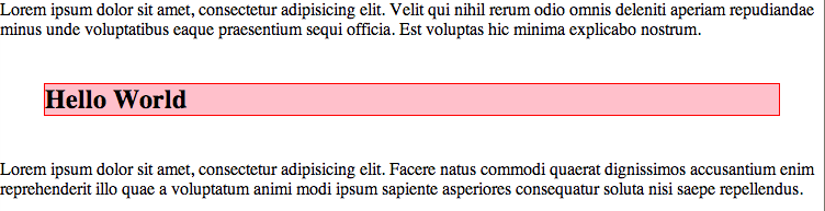
Margin vs. Padding
Adding padding to an element makes the element bigger, whereas adding a margin adds space around the element.
If you make a 100px wide element, and then add 40px of padding to it, it will become 180px wide.
If you add a 40px margin to a 100px wide element, it stays 100px wide.
If you add a 1px border to a 100px wide element, it will become 102px wide.
If your element doesn't have a border or a background, you may not be able to see the difference between margin and padding.
More on Margins and Padding
You can specify which side of an element you want your margins to apply to with the margin-top, margin-right, margin-bottom, and margin-left properties:
h2 {
  margin-top: 40px;
  margin-bottom: 40px;
}
The same goes for padding and border:
h2 {
  padding-bottom: 40px;
  border-left: 1px solid red;
}
Exercise: Box Model
- Add some
paddingto your profile image. This should create space between the image and the border around it. Try about 5px. - Add both
paddingand amarginto your 'favourite things' images. Try 5px for thepaddingand about 10px for themargin.
Solution: Box Model
Your code should look something like this:
img.profile {
  padding: 5px;
}
img.favourite {
  padding: 5px;
  margin: 10px;
}
Centering the Logo
We probably want that logo to be in the centre of the page. To centre elements in CSS, we set the margins on the sides to auto, which causes the browser to automatically calculate how much margin to add to each side to centre the element.
Instead of specifying both the margin-left and margin-right properties, we can use a shorthand that looks like this:
img {
  margin: 0 auto;
}
The 0 sets both the top margin and the bottom margin, and the auto sets both the left and right margins.
Centering the Logo
We need a way to target our logo element so that we don't end up centering all the images.
Add a class called logo to your logo <img> tag:
<img class="logo" src="images/logo.png">
Then write a selector in your CSS and apply the margin property:
img.logo {
  margin: 0 auto;
}
Nothing Happened!
Let's take a few steps back:
Remember the boxes with the red outlines?
Did you notice that the red outlines around the images don't stretch accross the whole screen like the other boxes do?
Nothing Happened, Part 2
This is because images are inline elements. Inline elements do not take up the full width of the page, they only take up as much space as the content requires.
Most elements, like <h2>, <p>, or <ul> take up the whole width of the page, these are called block elements.
Because our logo element is only as wide as the image, we can't centre it relative to the page. Luckily, this is easy to fix: we just tell the <img> tag to behave like a block element instead, by setting the display property.
img.logo {
  margin: 0 auto;
  display: block;
}
Other Inline Elements
Other common inline elements include <a>, <strong>, and <em>.
Inline elements don't create line breaks, so they are usually tags that you might find inside a paragraph or in the middle of a sentence.
Layout: Section by Section
Our site looks much better now, but now it's time to style the individual sections.
We'll need a way to target each section independently, grouping elements within the same section together, creating a layout.
Conveniently enough, HTML provides the <section> tag. We'll wrap each section within a <section> tag and add a class to each one, so we can style each section using CSS.
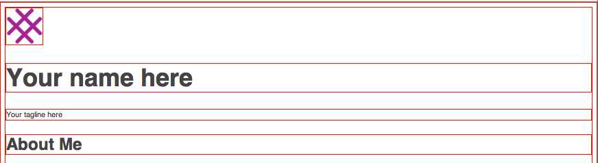
Banner Section
- Add an opening
<section>tag before the logo image - Add a closing
</section>tag right after the "tagline" paragraph - Add a class called "banner" to the
<section>tag
<section class="banner">
  <img>
  <h1>...</h1>
  <p>...</p>
</section>
Banner Section CSS
- Target our new
<section>with a selector in your CSS
section.banner {}
section.banner {
  padding-top: 110px;
  padding-bottom: 110px;
}
Adding a background image
- The CSS
background-imageproperty lets you specify a path to an image in much the same way as you would in an HTML<img>tag:
background-image: url('images/background.jpg');
Exercise: Add a background image
- Find a large image on your computer or on the internet and move it into the images folder in your project folder
- Add the image as a
background-imagefor the new banner<section>we just made - Adjust the
colorproperty for the section to something that contrasts with your background image - Set the
text-alignproperty tocenterto centre the text
Solution: Add a background image
- Your CSS should look like this:
section.banner {
  background: url('images/background.jpg');
  color: #ffffff;
  text-align: center;
}
Browser default styles
We have an ugly white margin around our whole background image!
This is because browsers (like Chrome) add a bunch of default styles, including margins, to HTML elements, such as on the <body>.
We can get rid of many of these unwanted styles with a snippet of code called normalize.css.
Open up the normalize.css file and copy and paste the contents to the top of your CSS.
CSS Child Selectors
Let's adjust some of the text in our banner section.
We probably want the paragraph text to be bigger, and the <h1> to have less of a margin at the bottom.
We need a way to select the paragraph tags in the banner section and only in the banner section.
We could add a class to it like we did with the images, but there's an easier way.
We can use the class we added to the <section> element to target the elements that are nested within it.
CSS Child Selectors
>You can write a child selector to select only those tags which are children of another tag.
We add a space between the parent and the child selector to specify:
section img {}
The above selector will select only those <img> tags which are nested within <section> tags.
CSS Child Selectors
To target the <p> tag within the banner <section>, we use:
section.banner p {}
Try increasing the font-size of the selected <p> tag.
Select the <h1> tag in the banner section in the same way and capitalize the text using text-transform: uppercase. Your CSS should look something like this:
section.banner p {
  font-size: 18px;
}
section.banner h1 {
  text-transform: uppercase;
}
The "About" Section
Let's repeat the process for the "about" section.
We'll wrap the section in <section> tags with a class of "about":
<section class="about">
  <h2>...</h2>
  <img>
  <p>...</p>
</section>
The "About" Section
Let's add a tiled background image to this section.
Use one of the "tile" image in the images folder, or look for one online. Try http://subtlepatterns.com. Download an image you like and save it to your images folder. Add the image as a background to the "about" section:
section.about {
  background: url('images/pattern.png');
}
Centre-aligning the header
We want the heading for this section to be centre-aligned.
So, let's select it with a child selector:
section.about h2 {}
And centre-align it with text-align: center:
section.about h2 {
  text-align: center;
}
CSS Floats
We want to align the profile image to the left, and allow the text to wrap around it. We do this using CSS Floats.
Remember how all HTML elements are rectangular boxes stacked on top of each other?
We have to break that stacking flow by floating the image to the side. This will cause the text after the image to move up beside it, because we've disrupted the flow of the rectangular boxes.
CSS Floats
We already wrote the selector for our profile <img>, so let's add the declaration float: left; to it:
img.profile {
  float: left;
}
This has 'floated' our image to the left, but there's a problem...can you figure out what it is?
CSS Floats
We broke the flow of rectangular boxes by adding float: left; to our image.
We need to restore the regular stacking of boxes after this section.
We do this by adding overflow: hidden; to the parent element (<section class="about">).
overflow: hidden; forces the element to 'contain' any floated children, so that they don't disrupt the elements after them
section.about {
  overflow: hidden;
}
Next Section: Favourites
There's not much to do here, but let's centre-align the entire section.
First, we have to add a wrapping <section> around the favourites content.
Add an opening <section> tag before the favourites heading, and a closing </section> tag after the last image:
<section class="favourites">
  <h2>...</h2>
  <h3>...</h3>
  <img class="favourite" src="images/kitten.jpg">
  <img class="favourite" src="images/kitten.jpg">
  <img class="favourite" src="images/kitten.jpg">
  <img class="favourite" src="images/kitten.jpg">
</section>
Centre-aligning
Let's write a selector for the section we just created:
section.favourites {}
And centre-align it:
section.favourites {
  text-align: center;
}
Exercise: "Contact" Section
- Repeat the process of adding a
<section>wrapper to the "Contact" section and centre-aligning using CSS. - Add a background image to the contact section.
- Add
margins around the images in the contact section.
Solution: Contact Section
Your HTML should look something like this:
<section class="contact">
  <h2>Contact Me</h2>
  <a href="https://">...</a>
  <a href="https://">...</a>
  <a href="https://">...</a>
</section>
And your CSS:
section.contact {
  text-align: center;
  background: url('images/tile2.png');
}
section.contact img {
  margin: 20px;
}
Styling Multiple Sections at Once
All ofour sections could use some spacing - they're a bit too squished together.
Let's add some padding to our sections. Since we're adding the same amount of padding to each section, we can avoid repeating ourselves by adding a class to each section we'd like to style, and then targeting this class in our CSS.
Add a class of box to each of the content <section>s (not including the banner section):
<section class="about box"></section>
<section class="favourites box"></section>
<section class="contact box"></section>
Styling Multiple Sections
Let's write a selector for our new class:
section.box {}
And add a bunch of padding to all our sections:
section.box {
  padding: 50px 100px;
}
Styling Multiple Sections, Continued
We can also use our box class to target the headings in each of these sections.
Since we're targeting both our <h2> and <h3> tags, we'll write a selector for both, separating them with a comma:
section.box h2, section.box h3 {}
And change the colour of our headings:
section.box h2, section.box h3 {
  color: #A8258D;
}
Now we have a nice-looking website with all the elements nicely styled!
But there's still more we can do to make our site extra special...
Making our background image fixed
To get that trendy effect where your background image stays put while you scroll, you can adjust the background-attachment property:
section.banner {
  background-attachment: fixed;
}
Adding Custom Fonts
Services like Google Fonts can make it easy for us to use fun fonts that aren't normally supported by all computers.
Go to Google Fonts and search around for a font you like.
Click "add to collection" when you find a font you like, then click the "use" button.
Find the code in Step 3 of the instructions, and paste it into the <head> of your HTML document (remember how the <head> section sends invisible instructions to our browser?)
<link href='http://fonts.googleapis.com/css?family=Oswald' rel='stylesheet' type='text/css'>
Adding Custom Fonts, Part 2
Copy the code from Step 4 of the instructions into your CSS.
Add the line of code anywhere you'd like to use your custom font.
Let's add it to all the header tags:
h1, h2, h3 {
  font-family: 'Oswald', sans-serif;
}
Adding a Menu
Let's add a menu to the top of our document so our users can navigate.
Menus are commonly marked up as lists with links inside each list item.
There are two types of lists in HTML: ordered and unordered (numbered and bulleted).
Since we don't need numbers, we'll use an unordered list, which is marked up with <ul></ul> tags to indicate where the list starts and ends.
Each bullet or "list item" in an unordered list is marked up as an <li></li> tag nested within the <ul> tag.
<ul>
  <li>One list item</li>
  <li>Another list item</li>
</ul>
Adding a Menu, Continued
Add a <ul> with a class of "menu" to the top of your HTML document, just inside the <body>, and add each <section> header as a list item inside. Note that we made each list item a link (more on that in a second). And don't forget the closing tag for your unordered list!
<ul class="menu">
  <li><a href="#about">About</a></li>
  <li><a href="#favourites">Favourites</a></li>
  <li><a href="#contact">Contact</a></li>
</ul>
Adding a Menu, Continued
Let's add some basic styles to the unordered list item, like a border and background, and lets remove the bullets from the list items:
.menu {
  list-style: none;
  padding: 0;
  margin: 0;
  text-align: center;
  border-bottom: 1px solid #434A5C;
  background: #ffffff;
}
Styling the Menu
We need to get our list items in a row.
Remember how we had display: block; and display:inline; properties?
Neither of those is quite what we want, because block will create a new line for each element, and inline won't let us add padding to the list items.
There's a third option that gives us the best of both worlds: display: inline-block;
Write a selector for the list items, and apply display: inline-block; as well as some padding to the top, bottom, and sides:
.menu li {
  display: inline-block;
  padding: 20px 35px;
}
Styling the Menu Links
Add a bit of style to the links in your menu. Remove the default underline with text-decoration: none
.menu a {
  text-decoration: none;
  color: #333333;
  font-weight: bold;
  text-transform: uppercase;
  font-family: 'Oswald', sans-serif;
}
Making the menu "sticky"
We can get our menu to stay at the top of the screen while the user scrolls with the position: fixed; declaration.
position: fixed; requires us to set the top and left properties to tell the browser where to fix the menu to.
This destroys the rectangular box around our menu, so we have to set the width back to 100%:
.menu {
  position: fixed;
  top: 0;
  left: 0;
  width: 100%;
}
Getting the links to work
We need to match the links in our menu to the sections on our page.
We can do this by adding an id attribute to each section that matches the link href (minus the # part):
<section id="about" class="about box"></section>
<section id="favourites" class="favourites box"></section>
<section id="contact" class="contact box"></section>